Are Old Conventions Making You Think the Dollar Rally Will Resume?

Monday, 18/05/2015 | 17:42 GMT by Peter Adamson
  • Next time you can't decide on which side of the market you should be, flip your chart upside down
Are Old Conventions Making You Think the Dollar Rally Will Resume?

Currency pairs are always quoted the same way, by convention. There is logic behind the choices. They are not arbitrary. Since the US dollar has been the central currency of the world monetary system since Bretton Woods, it is usually the base currency, quoted first. The other currency is quoted by its value in USD.

There are exceptions, however. Cable is always quoted the other way around because Sterling was not always a decimal currency and it would not have been possible to quote USD/GBP. You can imagine the Exchange rate expressed as £0 d5 p6! The Euro also is an exception. The Euro is quoted first in all EUR pairs, no exceptions, not even good ol' USD.

These choices have had unforeseen, and in my view largely unnoticed consequences. They determine how we chart the currency pairs, and therefore how we perceive value. Take EUR/USD for example. When the dollar is rising, EUR/USD is “falling”. But nothing is actually falling. One currency is appreciating and the other is deprecating. We could just as easily chart the values upside down so that prices “rose” as the dollar rose.

Consider this for a moment. This is entirely different from stocks. When we look at a stock chart, up is good. Prices are going up. Everyone is happy. Down is bad. People panic and sell of their shares. Companies go into overdrive with PR campaigns to reassure the public that all is well. This phenomenon has instilled a universal bull bias in chart reading.

Unwittingly we attribute one set of values to rising prices and another set of values to falling prices. We attribute imaginary physical properties to prices. They “fall under their own weight”. They “take off like a rocket”. We then wrongly (and unconsciously) do the same thing with currency charts. But there is no up or down with currencies. Every currency pair is a see-saw. When one side goes up the other side goes down.

Have you ever considered your own perception of a price chart? Can you feel the market running out of steam and getting “tired” near a top, or under resistance? The why can't you feel it getting “tired” near a bottom or above resistance? Support and resistance are the same thing. Tops and bottoms are the same thing.

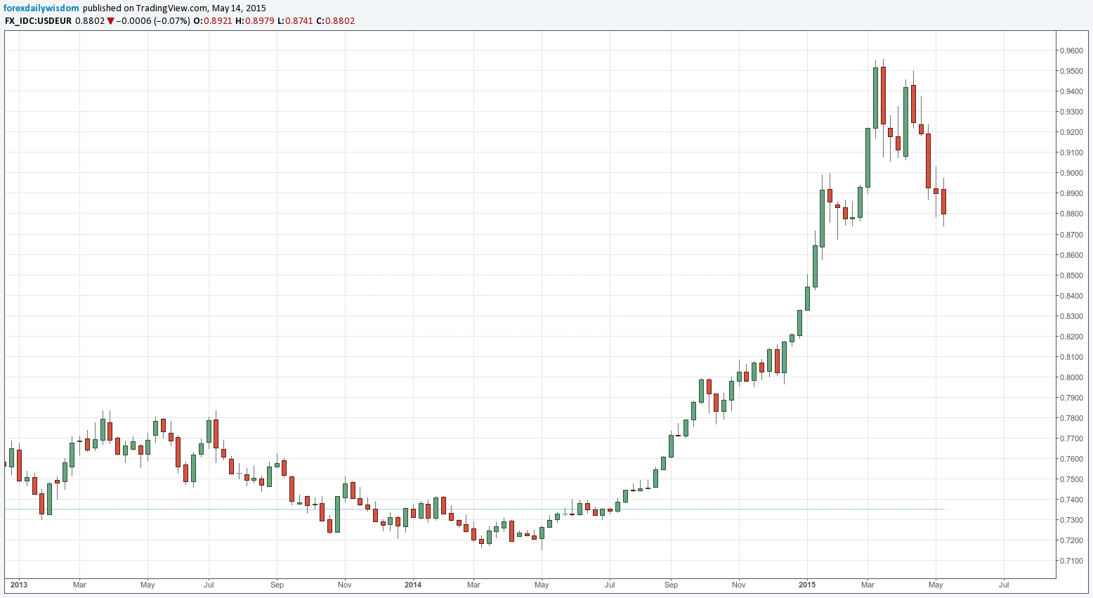
It seems that currently many analysts are waiting for the dollar rally to resume. Why? Maybe they should look at a chart upside down. Below is a chart of USD/EUR for your perusal. Does this look like a market that is about to take off like a rocket? I think not. I think that if the currency pair were quoted this way around it would be plain to all that the USD rally is over.

Next time you can't decide on which side of the market you should be, flip your chart upside down. It will challenge your neurons and make you see things differently.
usdconvntion18052015

Currency pairs are always quoted the same way, by convention. There is logic behind the choices. They are not arbitrary. Since the US dollar has been the central currency of the world monetary system since Bretton Woods, it is usually the base currency, quoted first. The other currency is quoted by its value in USD.

There are exceptions, however. Cable is always quoted the other way around because Sterling was not always a decimal currency and it would not have been possible to quote USD/GBP. You can imagine the Exchange rate expressed as £0 d5 p6! The Euro also is an exception. The Euro is quoted first in all EUR pairs, no exceptions, not even good ol' USD.

These choices have had unforeseen, and in my view largely unnoticed consequences. They determine how we chart the currency pairs, and therefore how we perceive value. Take EUR/USD for example. When the dollar is rising, EUR/USD is “falling”. But nothing is actually falling. One currency is appreciating and the other is deprecating. We could just as easily chart the values upside down so that prices “rose” as the dollar rose.

Consider this for a moment. This is entirely different from stocks. When we look at a stock chart, up is good. Prices are going up. Everyone is happy. Down is bad. People panic and sell of their shares. Companies go into overdrive with PR campaigns to reassure the public that all is well. This phenomenon has instilled a universal bull bias in chart reading.

Unwittingly we attribute one set of values to rising prices and another set of values to falling prices. We attribute imaginary physical properties to prices. They “fall under their own weight”. They “take off like a rocket”. We then wrongly (and unconsciously) do the same thing with currency charts. But there is no up or down with currencies. Every currency pair is a see-saw. When one side goes up the other side goes down.

Have you ever considered your own perception of a price chart? Can you feel the market running out of steam and getting “tired” near a top, or under resistance? The why can't you feel it getting “tired” near a bottom or above resistance? Support and resistance are the same thing. Tops and bottoms are the same thing.

It seems that currently many analysts are waiting for the dollar rally to resume. Why? Maybe they should look at a chart upside down. Below is a chart of USD/EUR for your perusal. Does this look like a market that is about to take off like a rocket? I think not. I think that if the currency pair were quoted this way around it would be plain to all that the USD rally is over.

Next time you can't decide on which side of the market you should be, flip your chart upside down. It will challenge your neurons and make you see things differently.

usdconvntion18052015
About the Author: Peter Adamson
Peter Adamson
  • 6 Articles
  • 15 Followers
Forex

More from the Author

Binary Options