I want you to imagine something nearly every trader has done or is doing right now – you open a trade and you set a profit target.
So far so good? Now ask yourself: What’s the probability that your trade reaches the target? The question seems simple enough though this has the potential to elude even the best traders sometimes.
Most of us have a ‘general idea’ of the answer to this or at least where our profit is going, hence why we are trading in the first place. Maybe you have done some backtesting or perhaps you have traded some system long enough to know.
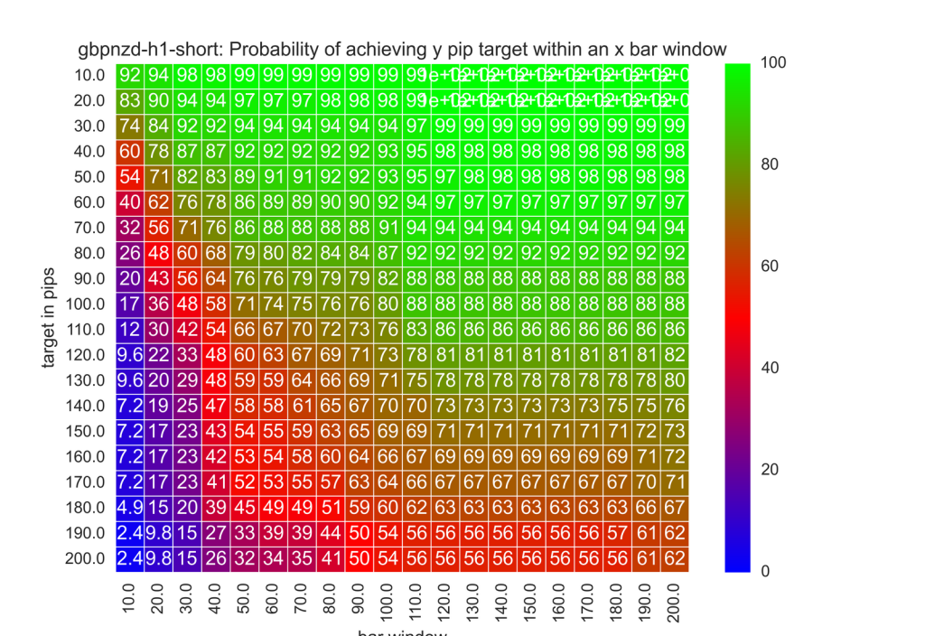
Either way, it's possible to generate probability heat maps by looking at the probability of hitting y target within x bar window for a respective currency pair. As an example, I have provided the GBP/NZD cross – more specifically, the number in each cell is the probability percentage of hitting y target within x bar window.

Why Is This Important?
This graphical representation is important because it reminds us that our win percentage goes up when we choose ‘easier’ or more feasible profit targets. However, there’s also something amazing going on here.
Looking at the chart above, specifically at 110 bars along the bottom we can see an interesting trend. This area represents how long you are giving the trade to ‘get to target.’ Conversely, now look at 40-pip target. Where they meet in the middle, you see that you have a 95% chance of the trade getting to the target.
Seems reasonable – now try doubling the target to 80 pips and see what happens – your win rate only goes down to 92% - still amazingly high, but diminishing nonetheless.
As a result, based on the map you get TWICE as much profit and you only lower your win percentage by 3 points. It seems incredible but it is in fact real. The tricky part is weighing what percentage you wish to achieve given profits.
This isn’t the end of the research however and we are NOT talking about trading systems here – we can talk about that another time. We are talking about the fact that when you trade a highly volatile pair like GBP/NZD, you should have big targets. More importantly you should not be afraid to do it. Sometimes more volatile pairs like the GBP/NZD behave much differently than the majors, thus a chart like the one highlighted above would not look the same as one for the EUR/USD for example.
I’d love to hear what you think about this research in the comments below.


