Technology provider PFSOFT has recently launched mobile versions of its Protrader Trading Platform for iOS and Android. The product had its public beta release earlier this year and has since gone through a few iterations and improvements. When first announced, I was very eager in seeing how the platform held up and reviewed it using both on a smaller size Android phone and iPad. Having met with PFSOFT CEO Denis Borisovsky, he told Forex Magnates that their goal is to create a ‘true’ multi-asset trading experience within one interface. He explained that this is a challenge as “completely different control functions are needed for different assets on both the server and client side.” Solving this problem, Denis Borisovsky added that “we found the similarities between markets and found the universal harmony between them. But keeping things simple is the most difficult.”
Having played around with Protrader’s downloadable and web-based platform, I was interested to see how they would ‘pack’ it all in a mobile device. When reviewing mobile products, there are typically two types of offerings, minimalistic and cluttered. The best minimalistic platforms succeed by providing an easy to understand interface that does one or two things very well, such as clear pricing and an order entry box. A solid app also provides easy access to additional features. In contrast, cluttered apps tend to try to do ‘too much’ and will often combine charts, order entry, and pricing on a tiny display. With Protrader, highlights of the desktop and web-based versions include highly customizable charts, lots of account information, market-depth, and entry order boxes. PFSOFT is also developing hosted automatic trading solutions that connect directly with Protrader. Therefore, due to PFSOFT’s emphasis on multi-asset functionality and providing multiple features within one interface, I was curious how the layout would be offered on a mobile device.
Android APP

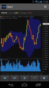
Despite the small screen I was using (not that tiny, but nowhere near Galaxy S4 levels), the interface was clear. The platform opens with a list of symbols, ordered by asset which can be customized for each trader’s needs. The layout is very basic, with current Bid/Ask prices prominently displayed and with one touch, users are able to open an order or load up a chart. Also, rather than fiddling around with menu tabs to call up other windows, the app uses a ‘slide’ based technology to easily access additional functions such as account, news, or orders pages. Among specific features, I was impressed by the charting package which was designed well and looked solid on the small screen even after adding technical indicators. Overall, it was what you want from a small screen mobile platform, minimalistic interface with ease of access to other features.
iPad
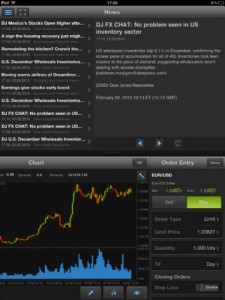
Unlike the Android based app, the iPad platform strives to take advantage of the larger screen size. While on paper we all want lots of features available at once, having seen the first publicly released version, my first impression was negative. My initial reaction was that they basically shrunk their web-based platform and wrapped it within an iPad’s 10” screen. While the screen is substantially larger than a phone, it didn’t accommodate well to the platform. For example, when opening the order box, users can’t just adjust the price and volume and then click buy or sell. Instead, the order window was bulky with users needing to scroll lower to send trades. Also, in the computer based offerings, Protrader segregates account windows based on orders, accounts balance and positions. A similar methodology was used on the iPad. This differs from platforms like MT4 which consolidates account information. On a computer where there is plenty of screen real estate, the segregated windows make sense, and are especially useful when opening more than five positions. However, on the iPad, users could only have one account window open at once; thereby forcing traders to jump between boxes to view positions and total account balances. Overall, the iPad platform fell under what I would characterize as a ‘cluttered’ app.
V2
As mentioned, the iPad app has gone through some updates. Knowing that PFSOFT was actively working on improving the interface I decided to hold off from publishing my review until seeing how version 2.0 performed. I’ll start off by saying that Protrader stuck to its guns and kept the overall multi-feature ‘shrunken platform’ interface.

However, what they changed, was integrated more functionality in each window. For example, in the early version, one item that stood out positively was the charting package. The product offers plenty of technical indicators and adjusted quickly to changes of timeframes and scrolling in an out of data. If there is anything about trading platforms that is a natural fit for touchscreens, charts are it, and the Protrader app takes advantage of this environment. In version two, they added a small order entry box within the chart. This small change removed the necessity to have to click to open the order entry window, which covered a good portion of the chart. Another small change was adding consolidated P&L and account balance figures within the open position window. This removed the need of toggling between different accounts related windows. While still appearing cluttered at times, the updated version provided a much more mobile experience than what was initially launched.
As mentioned above, Protrader is aiming to be the ‘go-to’ platform for brokers needing a multi-asset trading solution within one interface. In this regard, PFSOFT is differentiating itself from other retail oriented platform providers which have focused on specific asset classes such as forex, equities, or futures. Denis Borisovsky explained to us that by developing such a platform, the company is able to target non-brokerage financial firms , such as banks or white label firms that “want to extend their businesses to become brokers”. Overall, even when taking a look at the Protrader mobile platform, one can see PFSOFT’s goal of developing a multi-asset solution is very much part of the app’s DNA.
The article is part of Forex Magnates 'New Product Spotlight' posts. Previous writeups:


